This is the second article in a 2-part series about UX Deliverables. If you’d like to read part 1, you can do so here. Originally posted on Medium by Airship's UX design expert and Mapping lead, Holly Reynolds, on March 10, 2019.
Welcome back, my creative friends! It’s time to continue our UX Deliverables adventure. Something I touched on in the previous article that I have found to be more of a challenge this round is the incredible inconsistency with terminology in the UX industry.
“Words mean things” a co-worker of mine once said. And in the UX industry, we love making up new names for things that already had perfectly good labels. You’ll see more of this in this article, but I’ve tried to note when this occurs in hopes that it will offer some clarity.
This is a bit of a long read, so if you’ve been contemplating grabbing that cup of coffee before diving in, now’s the time to do so.
Maps
What does it mean to map the user experience? It means to document what we know about a user as they go through a specific process. Look at maps as a journal of sorts. Their purpose is to take all of those bits and pieces of things we know about our customers and lay them out in one location, so we can understand the bigger picture. The details vary from map to map, depending on the context, but they all include key touchpoints and how the users feel when hitting those touchpoints while interacting with either a product or service.
So, when do you need to map the user experience? When you have a process in place and want to understand where the opportunities for improvement are to increase customer satisfaction.
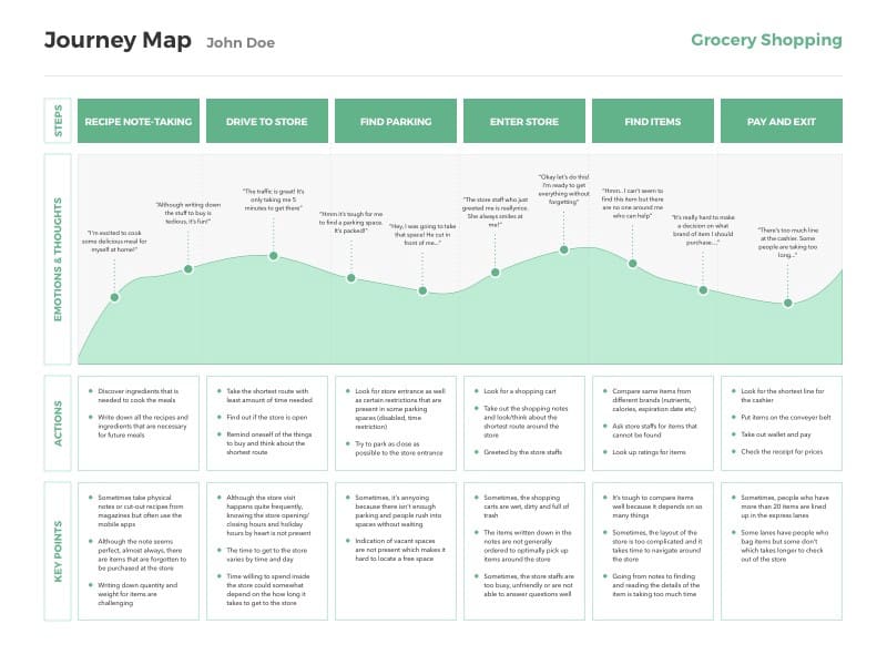
Journey Maps
Always created to support a known business goal, Journey Maps (also known as Customer or User Journey Maps) can help shed light on all of the steps, actions and key touchpoints involved in a process for an individual persona or user. They should always be created using feedback from actual users or a representative of the target group portrayed by the Actor (more on this below).
While their design and structure can vary quite a bit, they typically contain the following key items:
- Actor — who the Journey Map represents
- Scenario—a description of the situation presented in the map as well as the Actor’s primary goal or need and any specific expectations
- Phases — the unique high level stages of the journey
- Actions, Mindsets, Emotions — actual behaviors and steps taken by the Actor, what their mindset was during those experiences and how they felt about them (represented visually as “ups” and “downs” by a line)
- Opportunities — the insight gained by the team from these findings including what needs to be done, what the biggest opportunities are and insight into who may need to own any necessary changes
Experience Map
Similar to Journey Maps, Experience Maps are used to shed light on the steps involved in a process. Unlike a Journey Map though, they are used in a more generic sense, highlighting what a nondescript person experiences in a broader context. This may include the goals, actions and touchpoints involved in that process for that person as well as high level phases for each section of the process.
Something unique I’ve seen regularly with Experience Maps though versus Journey Maps, is that sometimes they include what the user did before and after the process as well as during.
For example, consider the individual looking to purchase a used car. Do they need something immediately or are they just browsing? And once they decide to start looking, where and how do they begin? Do they search online? Talk with friends? Hit dealerships?
After they’ve purchased the car, what’s next in terms of moving on with life? Do they spruce it up with add-ons or take it in for maintenance?
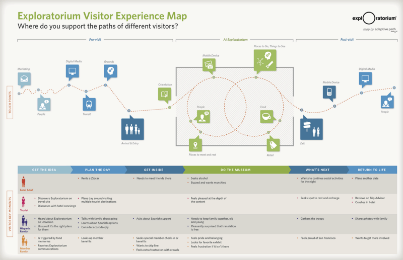
So when are Experience Maps useful? Ideally before beginning a Journey Map to help offer insight into general human experiences and behavior or possibly when needing to merge multiple processes into a single visualization.
Empathy Maps
What do your customers think and feel when they experience your product or service? Are they frustrated or peaceful? What do they see and hear? Where are they experiencing friction and where does the experience provide delight?
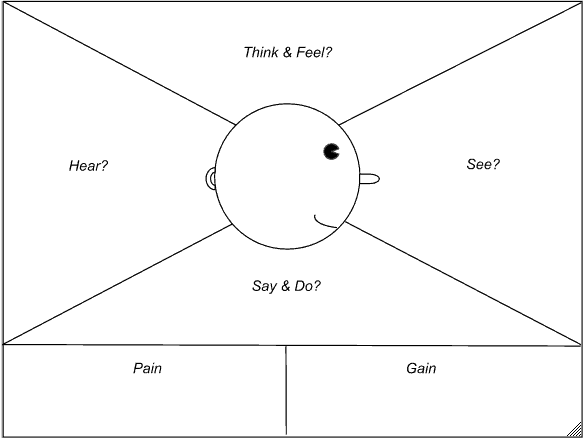
Originally created by Dave Gray, founder of XPLANE and BoardThing, the Empathy Map is a visual way to display all of this information and more in a simple layout. It is considered a collaborative tool which should be created by the team updating, building or designing “the thing” for the customer, so that they can gain insight and empathy into the user’s experience. They can be useful when creating user personas, capturing behaviors when interviewing a customer or simply building out user stories.
Empathy maps can represent a single type of customer or a group of customers, but all should be derived from actual customer feedback.
The process is simple. Once conducting research, share that feedback with your team and have them over it thoroughly. Then, gather everyone together and have them fill out on sticky notes the answers to questions you define surrounding the topics on the map. Think about what the user may be feeling when using the product in a normal setting. What about when their environment is filled with distractions? What might they be saying to friends or family about the product, and why? What are some of their pain points when using the product?
Once everyone has answered your questions based on their evaluation of the research, have them post the items in the applicable areas of the map, then evaluate them together as a group.
This will help your team to better understand and empathize with those they’re serving as well as offer clarity into any weaknesses in your research and help guide everyone in a unified direction.
Service Maps
Also known as Service Blueprinting (because words mean things), Service Maps are the antithesis of a Journey Map in that they focus on the internal staff experience with a process. They visualize the relationships between the people and physical or digital elements as well as processes tied to touchpoints in a specific customer journey.
Similar to a Journey Map, they are tied to a specific path or service. A bit more prescriptive though than the Journey Map, they are split into 4 swim lanes of actions and processes: customer actions, frontstage actions, backstage actions and support.
They are focused primarily on the service provider and internal staff, leaving out most customer details and help to uncover weaknesses in the organization, identify opportunities to optimize, bridge communication and efforts between departments, breakdown silos and unify teams.
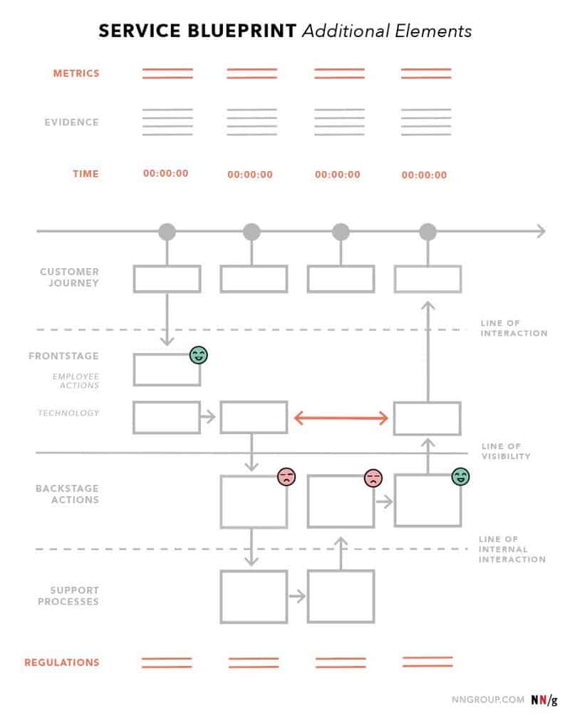
When should a Service Map be created? After a customer journey mapping but before making organizational or process changes. They may also be used to help pinpoint internal funnels or breakpoints.
Flows
So many flows… User Flows, Task Flows, Wireflows. As with other aspects of UX, some of these terms are used interchangeably but there are some differences worth noting.
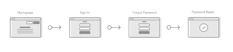
User Flows
Now that we’re experts on Journey Maps, it’s probably safe for me to describe a User Flow as a mini-journey map. They follow a user through an application in a simplified format, though not always in a linear fashion, accounting for the possible twists and turns in their process.
These are helpful as a starting point when you know you have a complicated process to document, such as a Journey Map. They themselves can easily evolve into more complex flows, but are a good starting point for outlining the basics in a user’s process.
Task Flows
Similar to our more generic Experience Map (but on a more basic level), Task Flows outline a single flow completed similarly by all users for a specific action. They do not branch out, but instead simply show what occurred on a linear view from A-Z.
Wireflows
Wireframes by themselves are useful in showing parts of a process, but not necessarily in identifying the flow. Combining the concept of workflows with wireframes helps to create a visual guide outlining what screens and key touchpoints a user may encounter while navigating through a product or website.
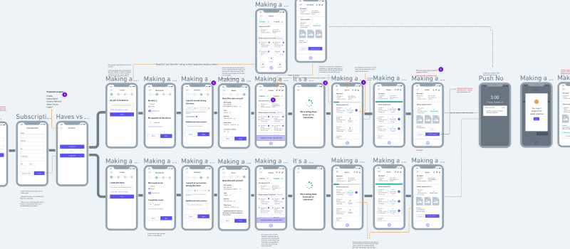
If you’re interested in more information on this topic, I wrote a separate article about this not too long ago titled “Wireflowing in Whimsical” which is a tool we use for creating various types of flows.
User Research
What is user research exactly? Is it researching the person and who they are? Perhaps its studying their actions and why they do what they do? Or maybe it’s evaluating the results of their actions and decisions? Is it user research when we don’t know our users and just want to understand who they are? The short answer to all of these questions is — Yes.
To further complicate matters, in addition to those questions, we may wonder what research is useful and what isn’t. How do we interpret the findings and what do we do with that information once we have it? Can we inadvertently do “bad research” and get the wrong information? And finally, is it ever too late to conduct user research?
This is a broad topic and one that easily warrants its own article (UX Booth has a great one here). Since this is a summary of deliverables though, I’ll touch on some key points.
Mike Kuniaysky, head of design at PARC and creator of their UX process, defines UX research as “the process of understanding the impact of design on an audience”.
Perhaps the best place to start therefore, is when to do what kind of research and why. There are multitudes of research methods and techniques out there and many can be done at any time in a product or service’s lifecycle and provide some level of value, but some may be more beneficial at times than others, so I’ll offer my recommendations as to what I’ve found useful and when below.

In the beginning…
Some people love beginnings. The team is often excited about creating something new, hopeful about the outcome and looking forward to the possibilities. But, beginnings are a critical point in the design process because often the research conducted at the beginning can help to shape the process for at least part, if not all of the product, service or feature’s lifecycle.
So where should one begin with research, in the beginning? IDEO’s Design Thinking methodology tells us the beginning of a design process should be about empathizing with the customers. I consider this, the Discovery Phase.
As an in-house designer, you may need to empathize with those who use your product, but you also need to empathize with internal stakeholders and those on your team. Begin your research by asking questions to these groups. The 5 W’s are a great place to start: Why do this? Who is it for? What does it need to do/be/offer? Where and when is it useful? And finally, how might we…? Surveys can also be a free and easy way to get good information from large groups of potential users.
If you’re looking to make changes to existing product, service or feature as part of your beginning, it is useful to evaluate how your audience is using or interacting with it currently. What are their pain points? What is working well? Are they doing things differently from how it was designed? If so, how and why? Doing a Task Analysis and understanding the existing Use Cases would also be valuable here.
You want to clearly define the goals and objectives surrounding what is being proposed. Be careful not to dive quickly into solutioneering (the fiery desire in each of us to go straight to solutions from the start), but to do the work upfront. It will help to weed out new questions and situations to explore, as well as align the team.
As an agency designer, you may need to add an additional group to this as you have to consider the needs of your clients from both a business and at times usability standpoint, as well as their customers.
A challenge I commonly encounter in this early phase is the feeling amongst some on the team that they already know the user well, and no further research will be necessary. Ask to see the data and research that’s already been conducted so you can evaluate what is truly known vs what is speculation. If there is none, then they’re likely acting on feedback they’ve heard either directly, indirectly, or possibly even just assumptions. In that case, it’s good to do the research. If there’s pushback, let them know the value for doing this research any way is to help align the entire team and build empathy as a group (as opposed to those ideas being stored up in one individual).
The Chaotic Middle
I’m referring to this as the middle but it can really mean any point in a design process that is neither the beginning, nor the end. This is typically the point where discovery work has been conducted and now you’re in the phase of deeper design and possibly conducting usability testing as well as iterating on feedback.

This can be a chaotic time to be conducting research. Often, everyone’s starting to feel the pressure of the project being in progress. Stakeholders are concerned with costs and deadlines, developers may have started building which means UX and/or design are at the risk of becoming a bottleneck while research is conducted and designs are iterated on.
Because of that, finding ways to get solid feedback fast is critical in this phase. As with Discovery, always start with what your goals are and what you’re trying to understand. Do you have a design in place and are looking for validation that you’re on the right track? Perhaps something has had to change from the scope perspective and now you’re forced to pivot a bit on the design and go with something different.
Getting something in front of your users quickly is essential. The methods may vary depending on what you’re trying to understand. Some examples of what may be useful in this phase could include:
- Focus Groups — where you can gather feedback from a group of users at one time in a moderated session
- Usability Testing — providing an existing design (in the case of the chaotic middle, perhaps a new prototype or design proposing the new possible solution) and getting feedback from actual users on it to understand pain points, interaction challenges, disruptions in flow and expectations as well as general understanding of their perception of the design. These can be done remotely or in person and still provide great value.
Sometimes, the chaotic middle is so messy because no research was done at the beginning. Perhaps a stakeholder, Project Manager or Product Owner came up with the entire feature and simply told the team to “make it happen”. Then you go to a design conference and realize it should’ve been happening all along. You go back to your team and push for it to be done. But now, it’s tricky because significant effort has been made and your findings could change that. So, where should you start?
A tool I love for this problem is the Unstuck Map. It may feel a little overwhelming to look at, but offers great suggestions on helping to define where you are, where you’ve been, and where you need to go from there.
THE NeverENDing Story
You’ve made it through Discovery and have solid understanding of your users, the problem and the business goals. You endured the craziness of the Chaotic Middle and learned much about the proposed solution as well as how your users feel about it. You’ve also iterated on that solution and made adjustments to help ensure your MVP is as successful as it can be.
The product has launched, the team has celebrated, and now their eyes are fixed on the next big thing. But, are you really done? A common problem in many businesses today is that once a product or feature goes out, there is no follow up to evaluate whether or not it’s truly on the right track. Even if analytics are in place, many do not know how to interpret it or what to do with the information.
Again, start with goals and what it is you want to understand. Perhaps you want to know if your customers are using the new feature? Do they find it easier than the old process? Maybe you’re hearing from your support team that people are complaining about an experience within your freshly launched product. You thought it was the right approach, and perhaps even received some feedback in testing that that was the case, but now it’s generating support tickets because your users do not understand how to proceed. Ideally, this sort of “gotcha” would surface earlier in the research, but sometimes even that can be conducted with bias and cause key issues to be missed.
As with the other phases, there are many methods that could be used to help in these areas, but here are a few I’d recommend:
- One-on-one interviews — If you are dealing with a situation where you want to know if you can improve a flow or existing experience, contact the users having some of the issues. Ask them to share the experience with open-ended questions (not “yes” or “no”) encouraging them to go into detail about what’s working and where pain points exist. If you are unsure of how to find the users, your support personnel may be a great place to start. Some companies have feedback portals where customers can request new features or share thoughts on issues with new features. Look for feedback related to your feature or product here, if applicable, and contact those individuals. Finally, simply ask your teams and internal stakeholders who you can contact. Typically, customer experience reps and PMs will have insight into at least a few key contacts.
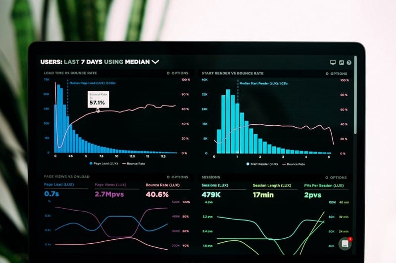
- Evaluate analytics information — If you haven’t spent much time in tools like Pendo or Google Analytics, and do not have access to someone who has, it’s good to study up just a bit and have at least a basic understanding of what the possibilities are. Some useful features found in these and similar products may include the ability to setup and track where users go from a specified location as well as defining a set of steps you expect them to take to complete a process and where they’re dropping off. These can be beneficial for understanding if your content structure is providing the paths to the most useful information for your visitors and if there are points in expected processes where perhaps the UI or system is interrupting their experience and causing a process failure.
- A/B Testing — Setting this up in many analytics applications these cans can be pretty simple. Let’s say you want to understand if changing the color of your primary call-to-action on a sign up page will encourage adoption. A simple A/B test could be to show one screen to half of your visitors with it one color, and a separate screen to the other half. Whichever seems to generate more signups can help provide insight into how to move forward with your decision.
High Fidelity
These are your fancy mockups. Optionally represented as flat designs or animations to show key touchpoints and interactions within a product, high fidelity screens help to clarify what a final product may look like in terms of styling and aesthetics. At Airship, we use high fidelity designs as part of our deliverables at the end of a Mapping. They give the customers a sense of what to expect from us for their product as designers, provide our developers with a good idea as to what level of UI work is involved, and allow us to have something to share as part of our portfolio (when permitted by the clients).
These tend to be some of the most fun aspects to work with for a designer, but they are by far more about show than function.
Market Research
As with some of the other deliverables here, there are many forms of market research. The areas I’ve experienced most being in UX, however, are Competitive Analysis, Personas, Jobs to be Done and Analytics.
“But wait, you said some of those were User Research, not Market Research!”.
Right you are, my dear reader! As with many areas of UX, there is a slightly confusing layer of overlap here. The type of research, conceptually, is the same. But the goals may vary some depending on what you’re trying to understand. In some cases, these types of deliverables are simply both considered Market and User Research.
So what are these things, when and why do we need them as UX pros?
Competitive Analysis (a.k.a. Competitor Analysis)
This is the process of analyzing the competition and understanding how the existing or proposed solution holds up against it. Start by determining who the competition is. There’s some debate it seems out there as to how to identify and label competitors, but in general they seem to be broken into at least two categories: direct and indirect.
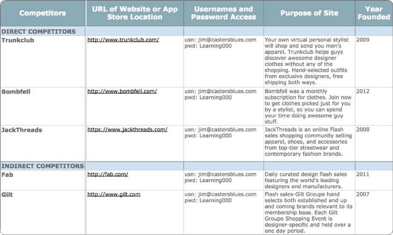
Direct competitors have a product, feature or service very similar to yours or your client’s and possibly share the same target audience.
Indirect competitors may serve the same needs for the customers, but are not necessarily similar in terms of what they offer. Basically, they can be used in place of you or your customer’s product, feature or service. For example, if you own a donut shop, a restaurant that sells great breakfast could be an indirect competitor.
Hubspot offers a great list of questions to consider when working through a Competitive Analysis and Aha! has a useful, free template.
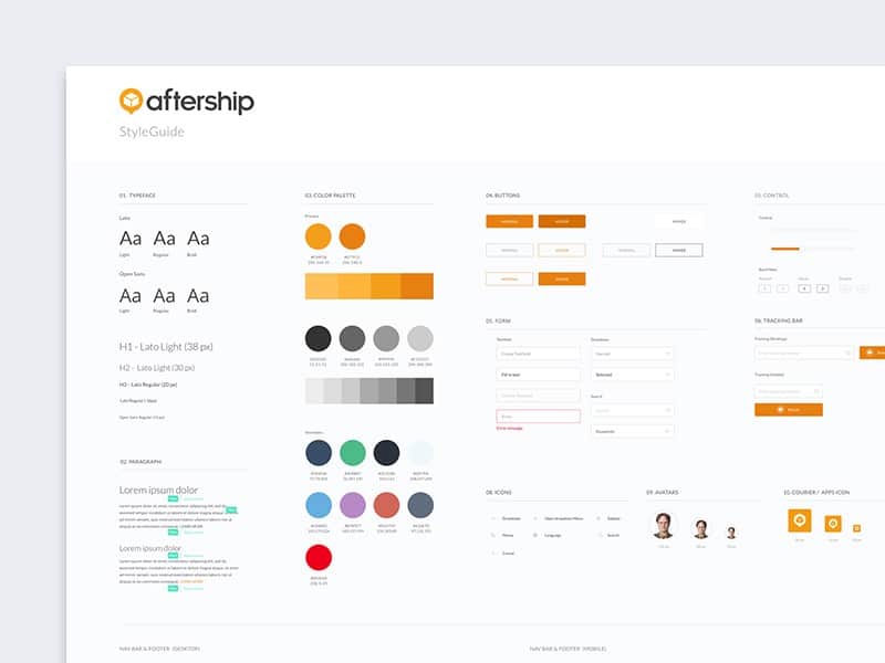
Style Guide (and friends)
The term Style Guide has been known to be used interchangeably in recent years with other deliverables that are similar, but not the same.
Here are some other terms you may have heard:
- Brand Guidelines
- Pattern Library
- Component Library
- Design System
Style Guide
The Style Guide itself, is simply the rules for the primary styles throughout a system, website or application. It may include fonts, colors, button styles, grid details, and similar information.
Brand Guidelines
Brand Guidelines are similar to a Style Guide and could potentially be found together, but for the brand itself. They may include proper use of the logo, approved corporate fonts and colors and other style details.
Brand and Style Guides can contain overlapping information. My perception of the differences between the two are the one focuses on styling details surrounding the corporate identity of the brand and the other on the styling details of a product.
Pattern Library
This is where you may find all of the details surrounding design patterns for a specific system, product or website.
What is a design pattern, you say? I’m so glad you asked! A design pattern is solution to a recurring design problem that is repeatable. For example, let’s say you’re on an e-commerce site and navigate to the Cart but haven’t added anything yet. You may see a little frowny icon and a message similar to: “You haven’t added in items to your cart” with a button to Continue Shopping. This an example of an Empty State. The pattern can be defined as the look/feel of these types of messages throughout an application or product, as well as with a definition as when to use that versus dummy or placeholder data.
Component Library
I often hear this term used interchangeably with Pattern Library but consider them to be slightly different in purpose (though they may be located in one combined system). Components show what something is and how it works. Examples may include modals, form elements, tool tips, and other specific elements. Patterns can include multiple components potentially but show how something should work in specific, repeatable situations.
Some Component Libraries contain code snippets for developers to be able to easily copy and paste into the product. This helps to ensure consistency in the UI and experience as well as saves them time over having to find a similar component and copy over the code from there.
Remember, you may see the terms Pattern Library and Component Library being used to refer to the same thing.
Design System
So how does all of this tie together in a sensible form? Welcome the Design System! This is the overarching product resulting from the combination of the previous guides and libraries. It’s where everything is found relating to styles, patterns, components and design details for your product or application.
You may need to create some or all of these systems at some point, and that is no small task. There are many great examples to review out there including these systems by Atlassian, IBM and the well-known Google Material Design system.
Conclusion
We have reached the end, friends! If you’ve made it this far, I congratulate you on your tenacious spirit! Thank you for your time and staying with me throughout this 2-part experience. I hope you have found it useful as part of your product design experience!